• Welcome to the new Internet Infidels Discussion Board, formerly Talk Freethought.

What are the real COVID-19 data/death rates etc?

Lumpenproletariat

Veteran Member
Joined
May 9, 2014
Messages
2,563
Basic Beliefs
---- "Just the facts, ma'am, just the facts."
How do we know what the real numbers are on the increase or decline of the Corona Virus?

In the news there seems to be a consensus that the U.S. is still getting worse, while all the other developed countries have gotten the Virus under control. They say Europe has mostly fixed the problem and is slowly returning to normal. So it's mostly good news except for the U.S.A. (Though it's getting out of control in many poor countries.)

And yet the tables/graphs showing comparison of countries still have Belgium being the worst, with Sweden and Spain and UK ahead of the U.S. in death rate per capita and positive cases.

So, where are the real facts/data, adjusted for population size etc., showing the real comparison of each country, and showing the latest daily trend of higher or lower rate of deaths or new cases?

Or, is it true that Belgium is still the worst, followed by Spain and Sweden etc., and the U.S. is not any worse than Europe generally?
 
I'm not sure it is feasible to get precise data from every different government throughout the world. For example I am amazed/slightly skeptical about the lack of fatalities in Vietnam whilst readily admitting I have no evidence to justify my misgivings. What I think is possible however, is to recognize certain trends and have the ability to make broad determinations such as the US doesn't have a handle on this yet, or that certain nations have been successful in flattening the curve.

This is further hampered when you consider how heavily politicized medical data regard Covid-19 is now. It makes tobacco lobbying/smearing during the 50s look like peanuts in comparison.
 
Sounds like you're expecting the rates to be universal, Lumpy?

But there are so many variables. Americans tend to be fat and stupid in this race. The tendency to carry more weight will affect our infection experience, plus how long we try to ignore the symptoms before seeking help. Which will affect the viral load of those around us as well.

I'd worry more about the numbers Trump's people are cooking than how we compare to saner countries.
 
How do we know what the real numbers are on the increase or decline of the Corona Virus?

In the news there seems to be a consensus that the U.S. is still getting worse, while all the other developed countries have gotten the Virus under control. They say Europe has mostly fixed the problem and is slowly returning to normal. So it's mostly good news except for the U.S.A. (Though it's getting out of control in many poor countries.)

And yet the tables/graphs showing comparison of countries still have Belgium being the worst, with Sweden and Spain and UK ahead of the U.S. in death rate per capita and positive cases.

So, where are the real facts/data, adjusted for population size etc., showing the real comparison of each country, and showing the latest daily trend of higher or lower rate of deaths or new cases?

Or, is it true that Belgium is still the worst, followed by Spain and Sweden etc., and the U.S. is not any worse than Europe generally?

The deaths per capita/positive cases per capita figures you're talking about are cumulative, not current. Belgium (and Spain etc.) were hit hard in March/April, but they have low to very low ongoing case/death counts. Most of the US was spared the worst in the spring, but the country is doing its best to catch up.

When you look at current deaths (e.g. at the 7-day average) and compare that to population figures, the US looks very much worse than Belgium et al.

According to https://www.worldometers.info/coronavirus/country/belgium/, The 7-day average of new deaths for Belgium is currently 4 per day. At a population of 11.4 m, that's 0.35 deaths per day per million people. The USA, on the other hand, has about 1050 daily deaths currently (taking the 7-day average again), at a population of 328 million. Per million people, that's 3.2 deaths per day, almost an order of magnitude more than Belgiums current rate.
 
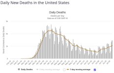
Incidentally, here's the daily deaths (with 7-day-average) graph for the US:

us_deaths.jpg

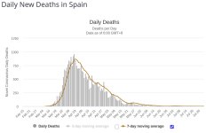
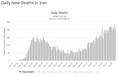
For comparison, here's Spain and Iran:

spain_deaths.jpg iran_deaths.jpg

Your mileage may vary, but I find the US trend looks much more like Iran with a five-week delay than like Spain.
 
The webpage [url]http://www.91-divoc.com/pages/covid-visualization/ offers graphs with several options.[/URL]

As of today the countries with high per capita new cases and high per capita new deaths include several Latin American countries, South Africa, U.S.A., and Iran. The U.S. case rate began rising mid-June; deaths began rising 3 or 4 weeks later.
 
Incidentally, here's the daily deaths (with 7-day-average) graph for the US:
What is encouraging is that even though 1b wave in the US is much bigger than 1a (mostly because b involves most of the rest of the country while 1a was focused on the North East), the daily death numbers are increasing much more slowly. The hope is 1b will have fewer deaths per case than 1a due to combination of better treatment and more testing leading to be there more mild cases reported compared to 1a.

For comparison, here's Spain and Iran:
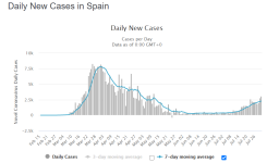
Spain still has more deaths/million (608) than US (473) even though reported per million cases are about half (7k vs. 14k for US). Most of Spain's reported cases came early in the pandemic and were thus more under-counted due to lack of testing. By the way, cases are picking up in Spain as well:
spain.png

Your mileage may vary, but I find the US trend looks much more like Iran with a five-week delay than like Spain.

I think Iran is seriously fudging their numbers fwiw.
 
Those graphs help a little. And the Belgium numbers.

According to that, both Spain and Belgium finally got their daily deaths-per-capita numbers down, or stabilized it at a low level.

But is the same true of Sweden and Italy and UK, which were worse than the U.S.? Is it correct to say that the U.S. is the only developed country which is experiencing increased daily deaths-per-capita? while the others have gotten those numbers down and flattened it?

https://www.worldometers.info/coronavirus/country/sweden/ gives a graph for Sweden which looks similar to the ones above, with the daily death rate way down from earlier. Does this mean Sweden has achieved the same results, flattening the death rate, even though they rejected all the precautions? Did all the old fogies die off in Sweden, so there's no one left for the virus to attack?

There doesn't seem to be a comprehensive listing of all (or most) of the countries, for comparison, giving the latest daily deaths-per-capita.

(Meanwhile, 3rd-world countries probably cannot be trusted to report accurate numbers.)
 
Back
Top Bottom