• Welcome to the new Internet Infidels Discussion Board, formerly Talk Freethought.

The Politics Of Every Major U.S. Religion, In One Chart

AthenaAwakened

Contributor
Joined
Sep 17, 2003
Messages
5,338
Location
Right behind you so ... BOO!
Basic Beliefs
non-theist, anarcho-socialist
ideologies.png

transparency.jpg

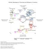
As Grant explains: “This new graph maps the ideologies of 44 different religious groups using data comes from Pew’s Religious Landscape survey. This survey included 32,000 respondents. It asked very specific questions on religion that allow us to find out the precise denomination, church, or religion of each person.”

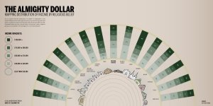
In other words, the dimensions of each color-coded circle reflect the relative size of the religious group it represents, and a circle’s position on the graph illustrates how the faithful feel about the government’s involvement in both the economy (bigger government with more services vs. smaller government with less services) and morality (greater protection of morality vs. less protection of morality). While the chart is revealing on its own, the policy questions in play — the economy and morality — are perhaps best analyzed alongside data detailing the average income of religious people from different faith groups. Pew Research has information on just that, which was used by GOOD magazine and Column Five in 2010 to create this beautiful infographic:

At first glance, one of the most notable correlations between the two charts is how closely racial and economic trends track with the demographics of religious groups — particularly on the question of government services. Since churches often serve as community hubs, pastors and congregants — and, by extension, full denominations — are usually sensitive to issues faced by people in their pews. Historically black Protestant denominations, for instance, are shown as having a high percentage of congregants (roughly 47 percent) who make less than $30,000 a year. This income bracket disproportionally benefits from crucial social programs such as the Affordable Care Act and the Supplemental Nutrition Assistance Program (a.k.a., food stamps), so it makes sense that denominations such as National and unaffiliated Baptists show up as overwhelmingly in favor of a government that offers more services. Similarly, White Mainline Protestants such as the United Methodist Church, the Episcopal church, and the Presbyterian Church (USA) have some of the wealthiest congregants in the country (36 percent of White Mainliners make over $75,000 a year) who don’t usually come in contact with many social services. As such, it’s not entirely surprising that they skew towards the “smaller government, less services” section of Grant’s scale. Meanwhile, Catholics, whose numbers include a relatively even distribution of income brackets that closely matches the national average, are situated roughly in the center of the chart.

But while income seems to indicate the probable political positions of some faith groups on the graph, Grant’s compilation also highlights several notable — and politically perplexing — exceptions. Sixty-five percent of Hindus make over $75,000 a year, for instance, but Grant’s chart depicts this wealthy group as firmly endorsing big government. Conversely, 58 percent of evangelicals — who, in Pew’s designation, are overwhelmingly white — make less than $50,000 a year, and many benefit directly from social services: white non-Hispanics make up 42 percent of our nation’s poor and receive 69 percent of government benefits, according to the Center on Budget and Policy Priorities. Yet most of the evangelical denominations, marked in dark blue, are huddled near the upper right side of Grant’s graph, indicating a solid preference for a smaller government with less services.

There are also odd outliers, such as white Pentecostals — who, on average, are poorer and less educated than the average American. They, like historically black churches, show up as decidedly left-of-center on the big government question, breaking the trend set by their fellow white conservative Christians.

Interestingly, the economic divide is also arguably even more consistent on the question of whether or not the federal government should do more to protect morality. One could contend, for example, that Grant’s graph adds weight to studies positing that wealthier people tend to gravitate towards looser moral standards. As mentioned, historically black churches and conservative evangelical denominations both have high percentages of churchgoers who earn less money than the national average, and both groups sit almost entirely on the half of the graph that calls for a greater protection of morality. But groups with high income rates — Buddhists, Unitarians, non-conservative Jews, the religiously unaffiliated (listed here as “nothing in particular”), and Mainline protestants — all lean towards a hypothetical administration that does less to reinforce moral codes. But this “the rich hate morals” argument gets muddled pretty quickly: Mainline protestant denominations are relatively wealthy, but they are decidedly more liberal than evangelicals on social issues such as homosexuality. As such, it’s possible that these progressively-minded respondents conflate the idea of “protecting morality” with harmful policies that restrict the rights of LGBT people.

The notable outlier on the morality question is the Church of Jesus Christ of Latter Day Saints (LDS), or Mormons, who live pretty comfortably as a people yet fervently support a more morally-minded administration. There are a number of possible explanations for this, but one could be that the top-down style of the LDS church and its teachings simply have an unusually deep impact the lives of Mormons. Three scholars actually explored this phenomenon a new book about the church, highlighting how Mormons are now one of the most “politically cohesive” groups in the country. This “theological impact” argument could also explain another odd division within the Jewish community that shows up in Grant’s chart: Adherents to Judaism fair relatively well economically across the board, but Conservative and Orthodox Jews seem to prefer a government that does more to protect morality. More liberal Jews, on the other hand, deeply support leadership that does less to protect moral standards.

Grants graph also exposes some possible disconnects between the professed beliefs of religious institutions and the opinions of those in their pews. For example, according to the chart, virtually all Mainline protestant denominations are firmly situated in the “smaller government, less services” side of the ideological spectrum. Yet Mainline protestant denominational heads have repeatedly and passionately participated in efforts such as the “Circle of Protection,” an ecumenical effort to safeguard social services that help poorer Americans. The same is true for Catholics: Catholic leaders have lobbied fiercely for both social programs (such as food stamps) and against policies they see as morally abhorrent (such as contraception), yet Pew’s data and Grant’s chart shows the average Catholic as roughly at the center of the idealogical spectrum on these questions.
http://thinkprogress.org/election/2...ype--campaign..campaignid--0..fieldname--id~~
 
Seeing as how atheists are all clustered together in one small section of the graph, it's amazing how many arguments there are in the politics forum here.
 
Why is atheism included in a chart about religions? If it was a chart about houseplants you wouldn't include empty pots would you?
 
Why is atheism included in a chart about religions? If it was a chart about houseplants you wouldn't include empty pots would you?

Because although atheism is not a religion, nearly all self-identified atheists actively reject the validity of most religions. That is whys being an atheist is highly predictive of various positions on moral and political issues. IF atheists were just people with nothing in common but a lack of belief in God, then being atheist would not reliably correlate with anything, and would be in the middle of that Chart. Although by definition, atheists merely lack belief in God, in practice most actively disbelieve God, the afterlife, the moral authority of any religious text or institution, etc.. In addition, all atheists have beliefs in many other things, and many of those things are impacted by whether you believe in God. Therefore, atheists tend to be similar to each other in ways in which they are different from most religious groups.
Note that Jews and Buddhists are the only "religions" near atheists, and that is because most "Jews" in America are non-theistic an large non-religious in their beliefs but are ethnically Jewish, and Buddhism is more philosophy than religious and often non-theistic.

In fact, "Catholics" in America are much less of a coherent group than atheists. Many of them are tied to the religion almost as a form of ethnicity and tied to the organization via its many rituals even when they do not share any it the religions core beliefs. Other Catholics are deeply religious and devout to the Pope, while yet others are "theists" at a vague level but pick and choose among the various specific ideas. That is why Catholics are so squarely in the middle of the graph. If they showed dots for each individual Catholic, they would be spread all over the graph, but when you average them out its at the midpoint of each of the two dimensions of moral and political views.

Atheists are mostly united in their rejection of government as a moral dictator, which is why their average is at the lowest end of that dimension. But they are closer to the middle of the economic dimension, because their is more disagreement there. Theism is the primary basis for moral absolutism and thus moral authoritarianism via government. So, rejecting God, rejects the prevailing basis to think that Gov should dictate morality (that is why theism is inherently at odds with human liberty and free thought). However, there are plenty of non-theistic bases for either supporting or resisting the use of government as a provider of shared services and regulator of economic activities (almost none of which qualify as merely personal or private acts because they directly use or impact people not directly involved in the transaction). Also, the core assumption of God do not as strongly support one position over the other, even though the hierarchy and equality of a theistic worldview is easily used to justify economic and power inequalities and thus tends to favor "less government" when government is being used to limit inequalities and abuse of the less powerful by the more powerful. Thus, atheists fall on the "more government" side but not to the extreme of religious racial minorities who have direct self-serving and non-religious reasons to favor controls on abuses by the powerful.
 
Interesting chart. The most interesting thing, I thought, was how he labeled the axes. "bigger gov't more services" versus "smaller gov't less services" makes sense. But the other axis should say, "bigger gov't more regulations of morality" versus "smaller gov't less regulation of morality".

Because it is absolutely factual that the religious right wants a "bigger government," just in a different way. But they recoil from acknowledging that, because they like to think they are rugged individualists who praise a “smaller government”. There's a proverb, "the democrats want government to get its fingers into your wallet; the republicans want government to get its fingers into your panties." The labels on the graph try to hide that reality, but it can’t be denied that the morality police make for a bigger government just the same.

It’s a very interesting graph that tells many other stories that I found interesting, such as the moderation of the nones and atheists viz public programs. So there is much to be learned from the data. But it exposes his bias to obscure such a large component by hiding who would be in charge of these "moral protections"
 
So the main difference between being atheist and being agnostic is how big you want government to be??

No.

Men are taller than women on average, yet their distributions on height greatly overlap. In terms of the % of their bodies covered in hair they are similar to each other when contrasted with other mammals.
If you saw a chart displaying these facts but ignoring countless other variables would you say "So, the main difference between men and women is how tall they are?"

That said, it is interesting that atheists lean left on government programs while agnostics lean right.
 
It would be cool to see a 4th dimension that displays the range of answers in each group.
 
It would be cool to see a 4th dimension that displays the range of answers in each group.
It could have been done with size of each bubble (which then would not generally be circular) represent not the size of the group but the range of points of view and with shading representing density of adherents supporting that view.
I am surprised that mainline Protestant churches (except American Baptists) are listed as pretty far on the "smaller government less services" side. That doesn't seem right.
 
Interesting chart. The most interesting thing, I thought, was how he labeled the axes. "bigger gov't more services" versus "smaller gov't less services" makes sense. But the other axis should say, "bigger gov't more regulations of morality" versus "smaller gov't less regulation of morality".

Because it is absolutely factual that the religious right wants a "bigger government," just in a different way. But they recoil from acknowledging that, because they like to think they are rugged individualists who praise a “smaller government”. There's a proverb, "the democrats want government to get its fingers into your wallet; the republicans want government to get its fingers into your panties." The labels on the graph try to hide that reality, but it can’t be denied that the morality police make for a bigger government just the same.

It is true that "protecting morality" usually means bigger government, but I don't think the labels are designed to hide that reality. I suspect (and hope if it valid research) that the labels reflect the questions that the research sample was actually asked. The questions about economic issues and programs probably mentioned "smaller" and "bigger" government because that is how people who differ on economic policies refer to it. Religious moralists don't refer to their desire for gov enforced morality as "bigger government", and would likely not endorse the statement if it included it, thus producing measurement error since the conservatives would agree with the heart of the idea but not endorse it as strongly due to that one word.

I think one of the most important things the graph shows and that social liberals often fail to appreciate is that blacks and other ethnic minorities only tend to vote Dem for the economic programs, but are rather extreme religious rightists and right wing authoritarians on moral issues. This is not news to those paying attention, but it highlights the fact that moral progress and liberty would be extinct in US politics, if the white Christian right were to manage to push their moral authoritarianism without tethering it to racism and instead found a way that brought minority religious conservatives on board.
 
It would be cool to see a 4th dimension that displays the range of answers in each group.
It could have been done with size of each bubble (which then would not generally be circular) represent not the size of the group but the range of points of view and with shading representing density of adherents supporting that view.
I am surprised that mainline Protestant churches (except American Baptists) are listed as pretty far on the "smaller government less services" side. That doesn't seem right.

I thought of that, but then I thought that the size of the group was very important information. E.g. the mormons are far right / top but there aren't very many of them, so politically they don't have as much voter sway (turnout being equal, which I know it isn't). So that was why I wanted another dimension. But shading could work to indicate the tightness of the distribution. A small dot or a large dot in a very light color has lots of range, for example.
 
It would be cool to see a 4th dimension that displays the range of answers in each group.
It could have been done with size of each bubble (which then would not generally be circular) represent not the size of the group but the range of points of view and with shading representing density of adherents supporting that view.
I am surprised that mainline Protestant churches (except American Baptists) are listed as pretty far on the "smaller government less services" side. That doesn't seem right.

They could also leave the size of each bubble as representing population %, but add lines extending out in each direction of each bubble representing 1 standard deviation above and below the mean. 1 Standard deviation range on either side of a mean (for a normal distribution) represents the range containing about 2/3 of the people in that group. Consistent with my prior comment, I would bet that Catholics would have the largest standard deviation, especially along the morality dimension, because it has become such a meaningless label for so many who still use it.
 
It is true that "protecting morality" usually means bigger government, but I don't think the labels are designed to hide that reality. I suspect (and hope if it valid research) that the labels reflect the questions that the research sample was actually asked. The questions about economic issues and programs probably mentioned "smaller" and "bigger" government because that is how people who differ on economic policies refer to it. Religious moralists don't refer to their desire for gov enforced morality as "bigger government", and would likely not endorse the statement if it included it, thus producing measurement error since the conservatives would agree with the heart of the idea but not endorse it as strongly due to that one word.

A great reason to start using the label, I think. Make them face their real ideology so they can start rejecting it. :D

I think one of the most important things the graph shows and that social liberals often fail to appreciate is that blacks and other ethnic minorities only tend to vote Dem for the economic programs, but are rather extreme religious rightists and right wing authoritarians on moral issues. This is not news to those paying attention, but it highlights the fact that moral progress and liberty would be extinct in US politics, if the white Christian right were to manage to push their moral authoritarianism without tethering it to racism and instead found a way that brought minority religious conservatives on board.

Very good point and a fearsome one.

- - - Updated - - -

They could also leave the size of each bubble as representing population %, but add lines extending out in each direction of each bubble representing 1 standard deviation above and below the mean. 1 Standard deviation range on either side of a mean (for a normal distribution) represents the range containing about 2/3 of the people in that group. Consistent with my prior comment, I would bet that Catholics would have the largest standard deviation, especially along the morality dimension, because it has become such a meaningless label for so many who still use it.

Good idea - or extending from the center; in case the std devs turn out to be smaller than the bubble.
 
A great reason to start using the label, I think. Make them face their real ideology so they can start rejecting it. :D


I recognize your smiley, but its important to point out that they wouldn't reject the real heart (and scariest) part of their ideology which is a desire to impose authoritarian morality on society and punish anyone who does things against their own personal tastes (that they dishonestly attribute to God).

At best, it would only get them to stop using the anti-big-government rhetoric, and its not how they sell it but what they are selling they most scares me.

Also, I would hope that the researcher's goal is to collect valid data that reflects what values people actually hold, rather than use research as a guise to affect political change. The two goals cannot be done at the same time, as we so often see with the "research" presented on these boards, no matter what political agenda they seek to advance.
 
Apologies if I missed it, but I can't see anywhere where it says exactly how they determined where to place the marker for each religion. Is it the mean of various responses? The median? The mode?
eg if the spread of responses to a question like "on a scale of 1 - 10, how much do you agree with this proposition" was, 1,1,3,3,9,9,9 would they say his group should be at 5 (the mean), 3 (the median), 9 (the mode) or something else?


They probably used the statistical mean, but these variables are almost always normally distributed and thus their mean, median, and mode are nearly identical.

Even for the subgroups where the distribution is not "normal", is likely due to most scores being at the extreme low or high end, in which case the mode and median are likely to be similar to but a bit more extreme than the mean.
 
Seeing as how atheists are all clustered together in one small section of the graph, it's amazing how many arguments there are in the politics forum here.
That's an *average*. It seems to me that right-libertarian atheists are much more loudmouthed about political and economic issues than most other atheists. It's like the zeal of Ron Paul's followers.
 
Back
Top Bottom