Jimmy Higgins
Contributor
- Joined
- Jan 31, 2001
- Messages
- 46,519
- Basic Beliefs
- Calvinistic Atheist
21st Century Irony
21st Century Irony
And Appliance repairmen are not a thing anymore.
Its troubling how TV news has declined so badly these days, particularly the local news. Constant misspellings (usually not as bad as the one above!), mispronounciations of local cities and streets, showing the wrong videos for a news items, etc. Occassionally, there is a LMAO that makes up for all the face-palms. Like this oldie, but goodie from my neck of the woods:
That reporter got fired.Sounds like the reporters were being pranked.
Three producers got fired. The anchor continued to work there for two years.That reporter got fired.Sounds like the reporters were being pranked.
There’s sum ting wong wid dat.The anchor continued to work there for two years.
And Appliance repairmen are not a thing anymore.
Its troubling how TV news has declined so badly these days, particularly the local news. Constant misspellings (usually not as bad as the one above!), mispronounciations of local cities and streets, showing the wrong videos for a news items, etc. Occassionally, there is a LMAO that makes up for all the face-palms. Like this oldie, but goodie from my neck of the woods:
Sounds like the reporters were being pranked.
No doubt. Hence her station nickname Sum Dum Ho.There’s sum ting wong wid dat.The anchor continued to work there for two years.
So bad. Making fun of a prane clash!No doubt. Hence her station nickname Sum Dum Ho.There’s sum ting wong wid dat.The anchor continued to work there for two years.
Ah, I heard the anchor got fired. I thought that was wrong of the station.Three producers got fired. The anchor continued to work there for two years.That reporter got fired.Sounds like the reporters were being pranked.
It's the bay bridge, Embarcadero in the foreground.
I HATE that!It's the bay bridge, Embarcadero in the foreground.
Ah Yes I see now.
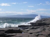
I'm on the lookout for strange stuff ever since I got a post card of Acadia where they flipped a spot of scenery I know very well on the horizontal to make the post card look better but the photo was totally wrong.
I HATE that!It's the bay bridge, Embarcadero in the foreground.
Ah Yes I see now.
I'm on the lookout for strange stuff ever since I got a post card of Acadia where they flipped a spot of scenery I know very well on the horizontal to make the post card look better but the photo was totally wrong.
To people who do it for compositional reasons -
It NEVER looks better. It just provokes subliminal cognitive dissonance and a negative association.
DON'T DO IT


