-
Features
-
Friends of IIDBFriends Recovering from Religion United Coalition of Reason Infidel Guy
Forums Council of Ex-Muslims Rational Skepticism
Social Networks Internet Infidels Facebook Page IIDB Facebook Group
The Archives IIDB Archive Secular Café Archive
You are using an out of date browser. It may not display this or other websites correctly.
You should upgrade or use an alternative browser.
You should upgrade or use an alternative browser.
Political Rant Funny Images II
- Thread starter Trausti
- Start date
GenesisNemesis
I am a proud hedonist.
- Joined
- Jul 24, 2006
- Messages
- 4,713
- Location
- California
- Basic Beliefs
- Secular Humanist, Scientific Skepticism, Strong Atheism
unapologetic
50+ years without a god
Maybe, or maybe it's blocked by my adblocker and tracking prevention.Does edge have a problem with tik tok?
SLD
Contributor
SLD
Contributor
Swammerdami
Squadron Leader
James Brown
Veteran Member
Jimmy Higgins
Contributor
- Joined
- Jan 31, 2001
- Messages
- 47,184
- Basic Beliefs
- Calvinistic Atheist
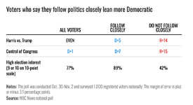
And that's why the voters keep trusting the GOP with the economy... because they don't pay attention.
crazyfingers
Supermagnon
And that's why the voters keep trusting the GOP with the economy... because they don't pay attention.
Whey don't pay attention
Also
On average less educated
On average more believing in crazy fictitious stories about gods and miracles
Much less comfortable with the unknown so gravitate towards those who express certainty even when totally wrong.
SLD
Contributor
James Brown
Veteran Member
Spacetime Inhabitant
Member
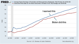
So, with that chart, earnings went from being equal to prices, to being 6% higher than prices under Biden - that looks like doing a good job.
Assuming you're serious....So, with that chart, earnings went from being equal to prices, to being 6% higher than prices under Biden - that looks like doing a good job.
The graph shows the percentage increase in both prices and wages since shortly before January 2020. Since then, prices have increased by between 20 and 25 percent, while wages have increased by between 25 and 30 percent. It does not (repeat not) mean that the two were the same to begin with - it simply shows the relative amount of increase in both over time.
But yes, looks like doing a good job.
Shadowy Man
Contributor
But because both of these are averages, it could still be true that certain classes of individuals have seen their prices go up faster than their wages. It would be interesting to see these numbers broken down a bit more.Assuming you're serious....So, with that chart, earnings went from being equal to prices, to being 6% higher than prices under Biden - that looks like doing a good job.
The graph shows the percentage increase in both prices and wages since shortly before January 2020. Since then, prices have increased by between 20 and 25 percent, while wages have increased by between 25 and 30 percent. It does not (repeat not) mean that the two were the same to begin with - it simply shows the relative amount of increase in both over time.
But yes, looks like doing a good job.
Spacetime Inhabitant
Member
Of course I was only referring to what was on the chart. I understand prices doesn't equal earnings, as that is a meaningless statement.Assuming you're serious....So, with that chart, earnings went from being equal to prices, to being 6% higher than prices under Biden - that looks like doing a good job.
The graph shows the percentage increase in both prices and wages since shortly before January 2020. Since then, prices have increased by between 20 and 25 percent, while wages have increased by between 25 and 30 percent. It does not (repeat not) mean that the two were the same to begin with - it simply shows the relative amount of increase in both over time.
But yes, looks like doing a good job.
GenesisNemesis
I am a proud hedonist.
- Joined
- Jul 24, 2006
- Messages
- 4,713
- Location
- California
- Basic Beliefs
- Secular Humanist, Scientific Skepticism, Strong Atheism
marc
Veteran Member
GenesisNemesis
I am a proud hedonist.
- Joined
- Jul 24, 2006
- Messages
- 4,713
- Location
- California
- Basic Beliefs
- Secular Humanist, Scientific Skepticism, Strong Atheism
GenesisNemesis
I am a proud hedonist.
- Joined
- Jul 24, 2006
- Messages
- 4,713
- Location
- California
- Basic Beliefs
- Secular Humanist, Scientific Skepticism, Strong Atheism

