• Welcome to the new Internet Infidels Discussion Board, formerly Talk Freethought.

Media treatment of Bernie Sanders: a story in pictures

Not so hilarious is what took place over the weekend for all to see.

It's one thing to be selective about a headline, or about what gets talked about in a news segment.

Deliberately falsifying poll results from your own poll is another story.
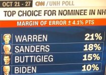
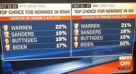
NH.JPG

Look at those numbers, and look at the poll they are referencing:
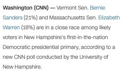
pollitself.jpg

They just went ahead and swapped the numbers for Warren and Sanders. Just changed them.

They also swapped Biden's and Buttigieg's, after the latter claimed this was a "two-person race" between him and Warren.

I have to ask, for anyone who is still defending the idea that the liberal media does not regard Bernie Sanders as a threat, or that Bernie Sanders and Elizabeth Warren are equivalent in policy terms for all intents and purposes... how do you explain this? When you see flagrant and unapologetic doctoring of reality like this, always at the expense of one candidate, and always to elevate candidates who are more friendly to corporations and the rich, how do you parse that information? How much of it needs to occur before a pattern is established?
 
Last edited:
Instead of just posting images, could you include reproducible links?

Here is a link to the article:
https://www.google.com/amp/s/amp.cn...litics/new-hampshire-poll-2020-cnn/index.html

The story was initially comparing an image of the article to Iowa (not NH) results:
https://twitchy.com/brads-313037/20...polls-over-sanders-in-defiance-of-cnn-itself/

Where/when did CNN show this as NH results?

When they push headlines and graphics on TV that do not match up with what their polls actually say, what, other than pictures, would be the correct way to demonstrate this? Are you saying they didn't actually report Sanders at 21% in the article versus 18% in the graphic? If not, what are you saying?
 
Instead of just posting images, could you include reproducible links?

As has been demonstrated numerous times, that would defeat the purpose. This thread is a study in irony.

The belief that there are these organized groups conspiring to harm us is very powerful. It's almost a religion in of itself.

The religion actually began with the Occupy Wall Street movement who effectively gave birth to the Cult of Bernie.

Well, actually, it all began with a Canadian magazine called Adbusters, who "organized" the first OWS rally as a publicity stunt for their magazine.
 
From Don's second link:

One cannot even claim there is a poll shift, or an anomaly taking place. From the text of this same poll: “Support for Sanders, Warren, and Buttigieg has been unchanged since July.” The only change over this period has been the erosion of Joe Biden’s campaign. Sanders has consistently been leading Warren. Yet CNN attempts to insist Warren is the leader.

The link confirms my point. The graphic in the image shows both the NH results (right) and the Iowa results (left). The NH results are the ones that do not match the corresponding poll.
 
Instead of just posting images, could you include reproducible links?

Here is a link to the article:
https://www.google.com/amp/s/amp.cn...litics/new-hampshire-poll-2020-cnn/index.html

The story was initially comparing an image of the article to Iowa (not NH) results:
https://twitchy.com/brads-313037/20...polls-over-sanders-in-defiance-of-cnn-itself/

Where/when did CNN show this as NH results?

When they push headlines and graphics on TV that do not match up with what their polls actually say, what, other than pictures, would be the correct way to demonstrate this? Are you saying they didn't actually report Sanders at 21% in the article versus 18% in the graphic? If not, what are you saying?

What is your source for your image? Where did you get it from? I think it was photoshopped because the original controversy was about Iowa resident poll vs New Hampshire resident poll. Buttiegieg does better in the midWest. For all I know, Hillary photoshopped it to make Bernie supporters look bad. Or Trump. So, again, where did you get the image?

Link.

Then, where did the people you got it from get it? Someone at some point allegedly took an image of CNN graphic. When did they do it? Why is there a twitter thread from Ryan Grimm of TYT who supports Bernie showing an Iowa graphic?
 
Instead of just posting images, could you include reproducible links?

Here is a link to the article:
https://www.google.com/amp/s/amp.cn...litics/new-hampshire-poll-2020-cnn/index.html

The story was initially comparing an image of the article to Iowa (not NH) results:
https://twitchy.com/brads-313037/20...polls-over-sanders-in-defiance-of-cnn-itself/

Where/when did CNN show this as NH results?

When they push headlines and graphics on TV that do not match up with what their polls actually say, what, other than pictures, would be the correct way to demonstrate this? Are you saying they didn't actually report Sanders at 21% in the article versus 18% in the graphic? If not, what are you saying?

What is your source for your image? Where did you get it from? I think it was photoshopped because the original controversy was about Iowa resident poll vs New Hampshire resident poll. Buttiegieg does better in the midWest. For all I know, Hillary photoshopped it to make Bernie supporters look bad. Or Trump. So, again, where did you get the image?
From the same source as you, Don. It's literally the same image.

Link.

Then, where did the people you got it from get it? Someone at some point allegedly took an image of CNN graphic. When did they do it? Why is there a twitter thread from Ryan Grimm of TYT who supports Bernie showing an Iowa graphic?
Click the image so you can see the whole thing. See how there are two sets of poll numbers, one corresponding to Iowa and the other to NH?

fullsize.jpg

Now, tell me if the numbers on the right side and who they refer to--for NH--match up to those reported by CNN.
 
From Don's second link:

One cannot even claim there is a poll shift, or an anomaly taking place. From the text of this same poll: “Support for Sanders, Warren, and Buttigieg has been unchanged since July.” The only change over this period has been the erosion of Joe Biden’s campaign. Sanders has consistently been leading Warren. Yet CNN attempts to insist Warren is the leader.

The link confirms my point. The graphic in the image shows both the NH results (right) and the Iowa results (left). The NH results are the ones that do not match the corresponding poll.

They are polls from 2 different states' residents! Bernie does well in NH because he is from VT. Buttiegieg does well in Iowa because he is from midwest. The second link shows how fucked up the internet is...in Ryan Grimm's twitter thread hundreds of people express outrage but only 2 people notice different datasets and no one listens. But the image you posted is alleged to be a NH graphic. Where did you get it?

Holy shit. I have to think you're gaslighting me at this point. We're both looking at the same image, right? The right side says "Top Choice for Nominee in NH". The top choice, with 21%, is listed as Warren. In the poll itself, the top choice is not Warren, but Sanders. What is so complicated about this?
 
I stand corrected. However, two minor points: 1. they were showing the Iowa part of the image which misled me and a couple others. 2. We can't independently confirm the image. I'm willing to tentatively believe it because it looks like a copy paste error.

So my mistake.
 
They are polls from 2 different states' residents! Bernie does well in NH because he is from VT. Buttiegieg does well in Iowa because he is from midwest. The second link shows how fucked up the internet is...in Ryan Grimm's twitter thread hundreds of people express outrage but only 2 people notice different datasets and no one listens. But the image you posted is alleged to be a NH graphic. Where did you get it?

Holy shit. I have to think you're gaslighting me at this point. We're both looking at the same image, right? The right side says "Top Choice for Nominee in NH". The top choice, with 21%, is listed as Warren. In the poll itself, the top choice is not Warren, but Sanders. What is so complicated about this?

No. We cross posted. I read your explanation after i posted.
 
I stand corrected. However, two minor points: 1. they were showing the Iowa part of the image which misled me and a couple others. 2. We can't independently confirm the image. I'm willing to tentatively believe it because it looks like a copy paste error.

So my mistake.

Twitter automatically zooms to the upper left hand side of any image that is posted, so I agree it may have been confusing at first. In terms of your second point, the pattern established by the network's treatment of the candidates, documented partly in this thread, suggests that whoever made the graphic simply copied the pictures and names from one poll and pasted them into the other. As you said, these polls are from two different states; there would be no reason whatsoever to copy and paste anything to begin with. It is also important to note who these slip-ups benefit and who they harm. If they were truly the result of random error, you would not expect so many examples to occur in which Sanders is undersold.

Or you are hearing specifically about the Sanders examples. In last election cycle we had some statistics showing Bernie was not covered as well as Hillary by like an order of magnitude. Do we have objective statistics again from a disinterested source? I am open minded to this based on past bias, but anecdotes told by Bernie supporters tweetng to other Bernie supporters is not convincing to me.
 
CNN on poll

article said:
Vermont Sen. Bernie Sanders (21%) and Massachusetts Sen. Elizabeth Warren (18%) are in a close race among likely voters in New Hampshire's first-in-the-nation Democratic presidential primary, according to a new CNN poll conducted by the University of New Hampshire.

Politco on poll

article said:
Former Vice President Joe Biden suffered a precipitous drop in the latest New Hampshire poll, falling to the lowest point his campaign has seen this cycle, while Sen. Bernie Sanders recaptured his first-place spot narrowly over Sen. Elizabeth Warren.
 
In last election cycle we had some statistics showing Bernie was not covered as well as Hillary by like an order of magnitude.

Which turned out to be false.

And here's an even more interesting tidbit from a comprehensive media study conducted by Harvard's Shorenstein Center on Media:

The real bias of the press is not that it’s liberal. Its bias is a decided preference for the negative. As scholar Michael Robinson noted, the news media seem to have taken some motherly advice and turned it upside down. “If you don’t have anything bad to say about someone, don’t say anything at all.”[3] A New York Times columnist recently asserted that “the internet is distorting our collective grasp on the truth.”[4] There’s a degree of accuracy in that claim but the problem goes beyond the internet and the talk shows. The mainstream press highlights what’s wrong with politics without also telling us what’s right.

It’s a version of politics that rewards a particular brand of politics. When everything and everybody is portrayed as deeply flawed, there’s no sense making distinctions on that score, which works to the advantage of those who are more deeply flawed. Civility and sound proposals are no longer the stuff of headlines, which instead give voice to those who are skilled in the art of destruction. The car wreck that was the 2016 election had many drivers. Journalists were not alone in the car, but their fingerprints were all over the wheel.

In regard to Trump, the study had this to say (among other points):

When asked to explain their focus on Trump, journalists say that he made himself readily available to the press.[13] But availability has never been the standard of candidate coverage. If that were so, third-party candidates and also-rans would dominate coverage. They hunger for news exposure. Trump’s dominant presence in the news stemmed from the fact that his words and actions were ideally suited to journalists’ story needs. The news is not about what’s ordinary or expected. It’s about what’s new and different, better yet when laced with conflict and outrage. Trump delivered that type of material by the cart load. Both nominees tweeted heavily during the campaign but journalists monitored his tweets more closely. Both nominees delivered speech after speech on the campaign trail but journalists followed his speeches more intently. Trump met journalists’ story needs as no other presidential nominee in modern times.

Re Clinton:

Like Trump, Clinton’s coverage was negative in tone. Unlike Trump, it was a continuation of a pattern that had been set at the start of her presidential run. In the nineteen months leading up to the general election, there were only two months where Clinton’s coverage was positive on balance, and then by less than 5 percentage points in each case. The general election campaign continued the string. Her coverage in every month—August, September, October, and early November—was negative on balance. During the entire general election, there was only a single week where the balance was positive (see Figure 12). That week was the one following the first debate, where her strong performance pushed her into positive territory for the week, though by the slim margin of 4 percentage points.

More of course at the link.
 
Back
Top Bottom