lpetrich
Contributor
The US state of Minnesota now has a new flag.
So they started this: State Emblems Redesign CommissionStart with legibility. Viewed from afar, it is difficult to make sense of the jumble of dates, stars and the state slogan, in French, which rings the centerpiece image.
...
Zoom in on the scene depicted at the core, which happens to be the state seal, to understand why a lawmaker who led the latest effort to retire the flag calls it “a cluttered genocidal mess.”
In the foreground is a pioneer using a plow next to a tree stump, which features a rifle and an ax. Behind him is a Native American man on horseback, spear in hand, riding beside a sunset.
“It’s literally a Native person being driven off their land,” said Lt. Gov. Peggy Flanagan, a Democrat, who is a member of the White Earth Band of Ojibwe and has refused, on principle, to use the state flag or seal in official correspondence and paperwork. “It’s horrific.”
They came up with a lot: FlagsThe plan to replace the flag has faced a measure of resistance. Some lawmakers have asserted that the scene in the seal should not be construed as racist. Farmers have voiced concern that the new designs fail to pay homage to the state’s agriculture sector.
The State Emblems Redesign Commission, which is chaired by the Minneapolis-based artist Luis Fitch, provided detailed guidance for submissions. Entries needed to be simple, easy to recognize, free of lettering and “represent Minnesota’s enduring values and aspirations, emphasizing inclusivity and unity.”
A great many featured loons, which turned out to be a losing strategy since not one of the flag designs featuring birds was among the finalists. Some were rendered by children — we hope? — with crayons. Submission F156, a vertical photo of a Labrador retriever on a grassy field, got much love on the internet. Snowflakes abounded, as did renderings of the state motto, “L’etoile du Nord” — the North Star.
The commission also has a new design for the state seal: SERC - Finalist Seal - S224 featuring aThe commission must submit the winning design to the Legislature and governor by Jan. 1 for final approval. A new flag is expected to make its debut on May 11, Minnesota’s 166th birthday.
The winning design for the seal features a loon, the state bird, in a striking pose, surrounded by other common features of Minnesota: waves, wild rice, pine trees and stars. The winning design retains a similar shape, typography and pattern to the original seal, which was adopted in 1858, the year Minnesota became a state.
Texas's flag is visually striking while Nebraska's is a big fat mess.What makes a good flag?
- They’re simple and therefore easy to remember.
- They display symbols that are meaningful to their state.
- They use just a few colors.
- They don’t rely on lettering or seals.
- And they don’t look like any other state’s flag.
“If you look at the Texas flag, no matter where you see that flag, if it’s flying, if it’s on a mug, if it’s on a postcard, you know the Lone Star State,” she said. But with Illinois, she said, “you wouldn’t know it was the Illinois flag other than the fact that ‘Illinois’ is emboldened at the bottom of it.”
Aesthetics aside, if one goal of the new Utah flag was to unify the state, it has not yet succeeded. Particularly for some on the political right, the new banner has become a symbol of an unwelcome and much broader push to change things that do not need changing.
“They’re watering down the history, they’re watering down the significance, so they could slap it on a hat and slap it on a T-shirt and make a couple bucks,” said Chad Saunders, an organizer of the opposition to the new flag. “That has nothing to do with pride.”
SERC - Next Minnesota State Flag
Designer Andrew Prekker's solution has a dark blue stylization of the state on the left with a white star in it, with three horizontal stripes on the right. From top to bottom: white, green, light blue.

Are conservatives truly stupid enough to believe this crap, or just trolling? Like, you really think they looked up an obscure regional Somalian flag for inspiration as part of some sort of bizarre Islamist plot?SERC - Next Minnesota State Flag
Designer Andrew Prekker's solution has a dark blue stylization of the state on the left with a white star in it, with three horizontal stripes on the right. From top to bottom: white, green, light blue.
I guess the green was supposed to be symbolizing Islam, since Minnesota is in the process of submitting voluntarily ...
Prekker's Minnesota flag:
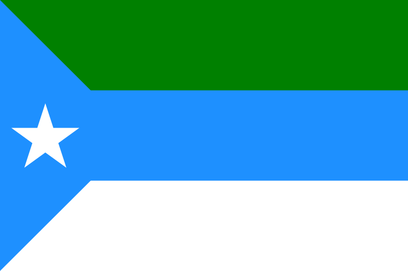
Jubaland (in Somalia) flag:
No wonder Ilhan Omar likes it. And I guess Andrew Prekker is a plagiarist.
Eh, I like it. I'll recognize it anywhere I see it from here on out... Unlike the previous flag which I couldn't differentiate at a distance from any other seal-on-blue state flag.As a Minnesotan, I can attest tge vast majority if us could not recognize the previous flag and will mot recognize this one in 2 weeks or less.
A small portion of the population was really invested in this project. I do like the blue but nothing on that flag says “ Minnesota” to me.
")

View attachment 44968
I like our state flag, as I'm a big fan of grizzly bears (despite being personally scared shitless of them). I love the irony of it too. According to historical records, the grizzly bear in the flag is designed to be a symbol of strength and unyielding resistance. Any yet, we killed them all off, and they have been extinct in this state for many decades.
*sigh*SERC - Next Minnesota State Flag
Designer Andrew Prekker's solution has a dark blue stylization of the state on the left with a white star in it, with three horizontal stripes on the right. From top to bottom: white, green, light blue.
I guess the green was supposed to be symbolizing Islam, since Minnesota is in the process of submitting voluntarily ...
Prekker's Minnesota flag:
I heard a story that Bartlet said pear and it got confused with bear.View attachment 44968
I like our state flag, as I'm a big fan of grizzly bears (despite being personally scared shitless of them). I love the irony of it too. According to historical records, the grizzly bear in the flag is designed to be a symbol of strength and unyielding resistance. Any yet, we killed them all off, and they have been extinct in this state for many decades.
I had to google, but yeah. I see what you mean.States with flags prominently displaying an X design should consider updating their flags. My state flag looks like the confederal flag with a cookie in the center.